

Pathway to Parenthood Foundation (PTPF) is a Nigerian nonprofit that co-funds 30% to 50% of eligible IVF and surrogacy costs for approved applicants. Its work sits between families, donors and fertility providers, and each of them arrives with something different at stake.
BeeTcore redrew the brand identity, built the brand guide and set the voice PTPF now uses for every page, form and email. The same team then designed and built the PTPF website. PTPF joins the charities and faith-based organisations BeeTcore works with.
4
10
4
Fertility support is a category where one careless phrase does real harm. Promise too much and a family hears a guarantee. Sound too clinical and they feel processed. Sound like a charity appeal and donors start to wonder where the money goes.
PTPF was new. It had a logo, but no system around it and no agreed way of speaking. It needed to look like a well-run foundation from the first day and speak to four audiences without contradicting itself.
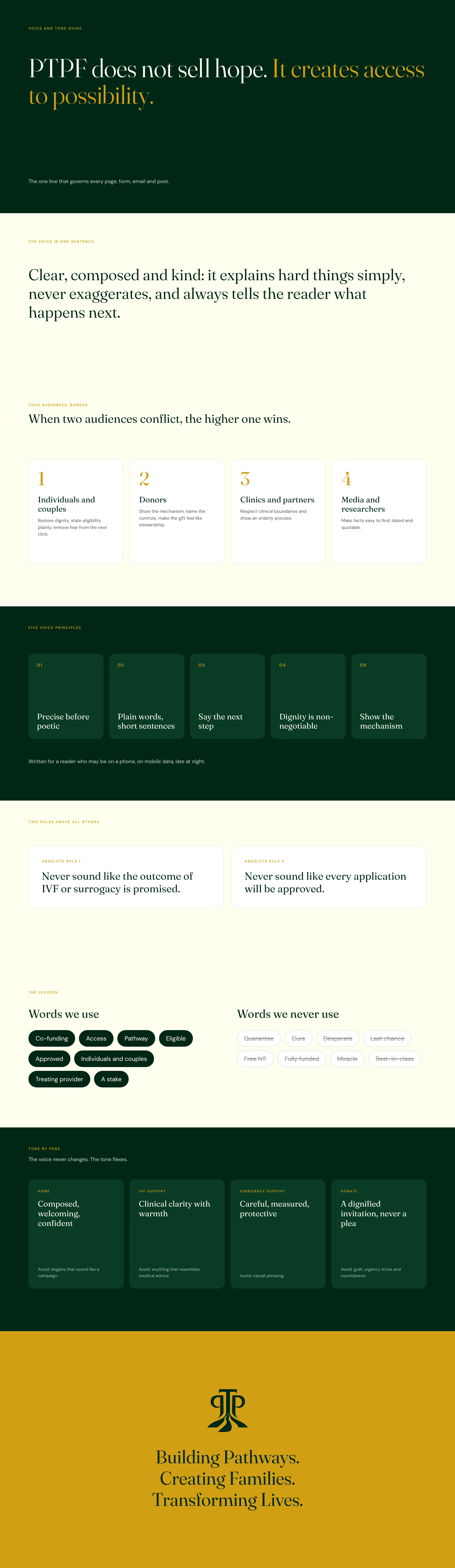
Before a single page was designed, BeeTcore set how PTPF speaks. The strategy work started from PTPF’s own words and turned them into a guide anyone on the team can write from. It ranks four audiences, so when a sentence could impress a donor or reassure a family, the family wins. It sets five voice principles, two absolute rules and a lexicon of words PTPF uses and never uses.
The two rules sit above everything else: never imply a guaranteed treatment outcome, and never imply every application will be approved. The guide also sets the tone for each page and moment, from the eligibility check to a donor receipt, and shows how to write so search engines and AI assistants quote PTPF accurately.
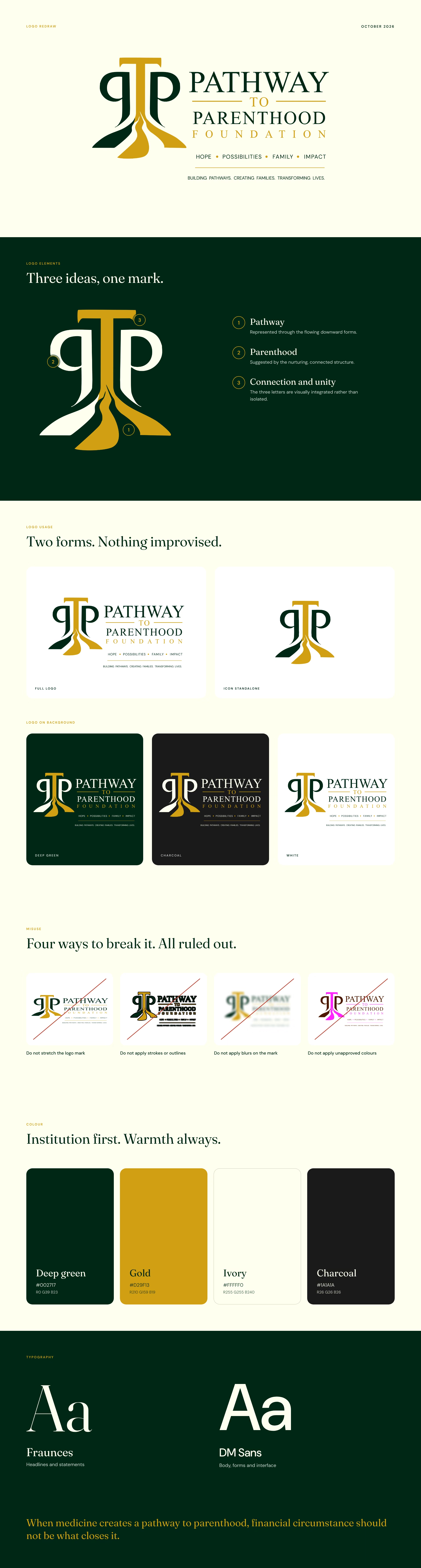
PTPF arrived with a logo. BeeTcore redrew it into a clean master with a full version and a standalone icon, then wrote the rules that keep it intact: no stretching, no outlines, no blurs, no unapproved colours and no moving the mark.
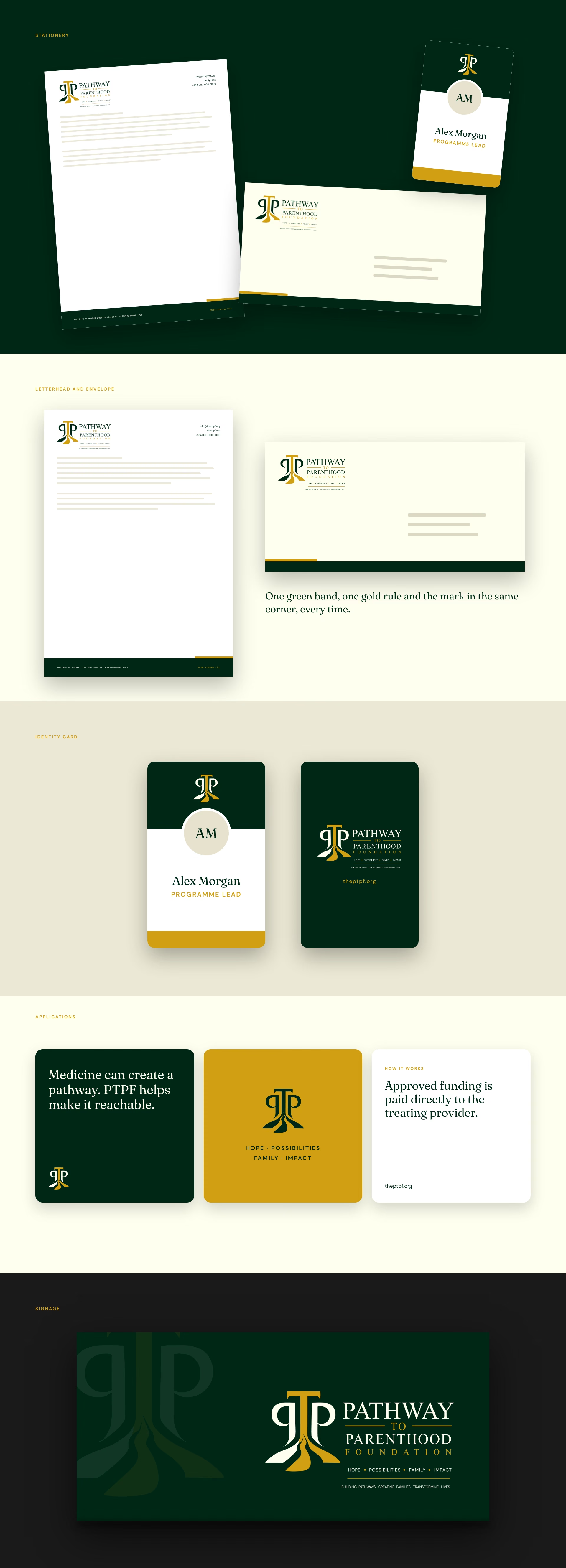
The guide turns the mark into a system the team can brief from: brand story, mission and vision, colour values, type, stationery and applications. The same thinking carried straight into the website, so brand and site were built as one piece of work. For another charity brand built for more than one audience, see the Upsurge Youth identity.
One mark, one palette and one voice, built to be trusted before it is known.
The redrawn mark carries three ideas in one shape: a pathway that flows downward, a nurturing form for parenthood, and three letters joined rather than standing apart. Deep green carries the weight of an institution. Gold adds warmth without tipping into luxury. Fraunces gives headlines a calm, editorial feel, and DM Sans keeps everything else plain and easy to read.
PTPF launched with a brand that looks governed and speaks with care. Every page on the website was written from the voice guide, and the same rules now cover forms, emails, receipts and social posts.
The voice shows in the details. Approved funding is “paid directly to the treating provider”. The eligibility check says up front that it asks for no documents. The 2030 ambition is labelled as targets, not results. See the website case study for how the voice became pages.


At BeeTcore we design, build and grow websites, platforms and digital products that keep working long after launch. Over a decade in, 550+ projects delivered.
BeeTcore Solutions