

Upsurge Youth helps young people in the UK find work, look after their wellbeing and reach secure housing. Three audiences sit at the centre of that mission and none of them want the same thing. A nineteen-year-old looking for a first job needs warmth and plain language. A grant panel needs structure and evidence. An employer needs confidence that a partnership will be run properly.
BeeTcore built the brand identity and the campaign toolkit around it: the mark, a 45-page brand guide, stationery, print, merchandise, social and a logo animation. Upsurge Youth joins the charities and faith-based organisations BeeTcore works with.
45
9
3
A charity that serves three audiences can end up with three personalities.
Say it one way and the funders take you seriously while the young people scroll past. Say it the other way and you win the room but lose the grant. One mark and one system had to carry all three without ever sounding like three different organisations. It also had to work at both ends of the scale, from a favicon to a two-metre banner standing in a community hall.
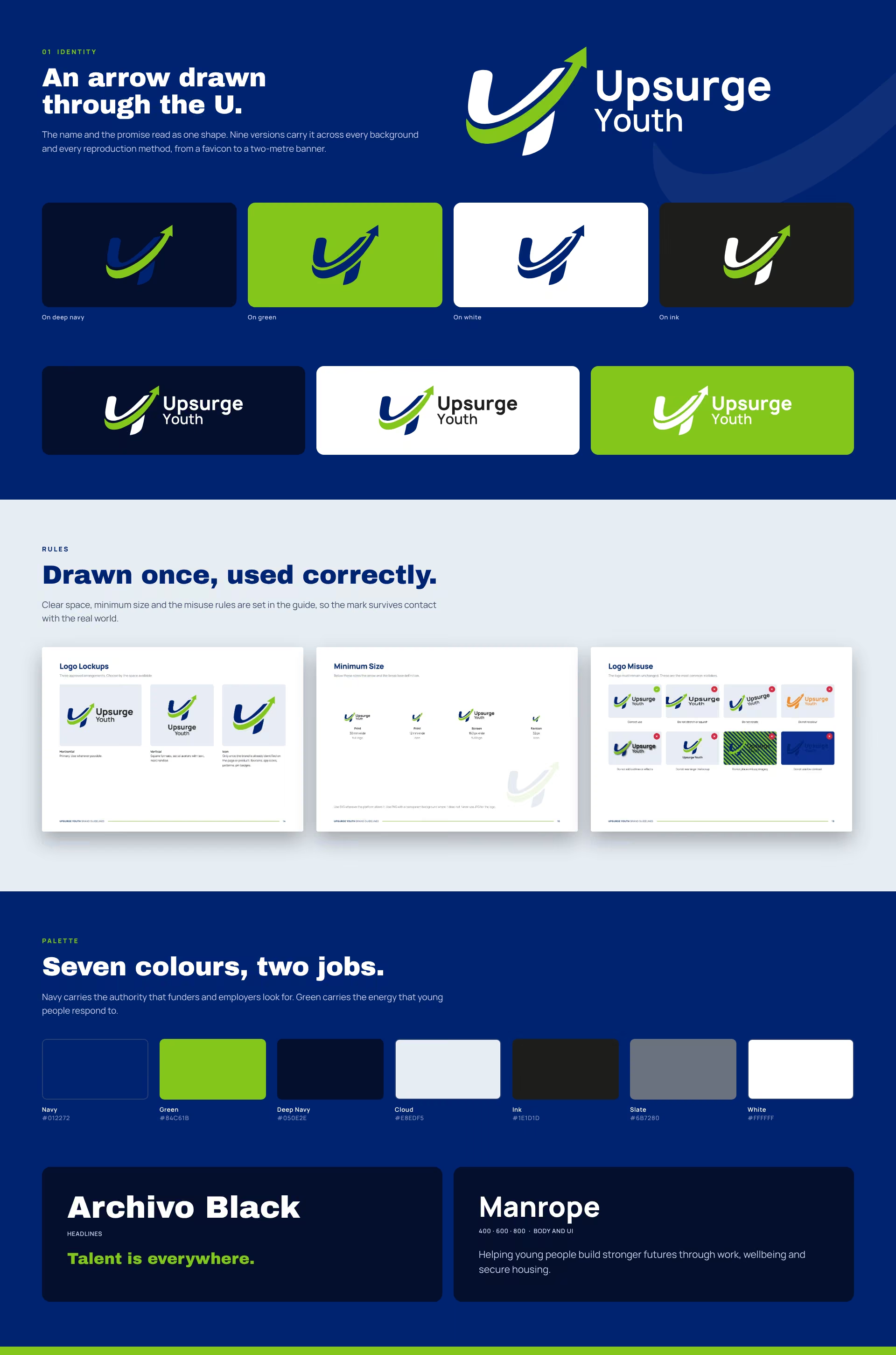
The mark came first and everything else answered to it. The arrow through the U had to survive being shrunk to a favicon, printed in one colour on a pen, and blown up to banner height. Nine versions cover every background and every reproduction method, so nobody has to improvise.
A 45-page guide turns the mark into a system anyone can use. Colour values, type scale, layout grids, photography direction, tone of voice and merchandise application. The guide exists so the charity can brief a printer or a volunteer without calling a designer first. For a system taken further still, see a design system built out to full tint scales.
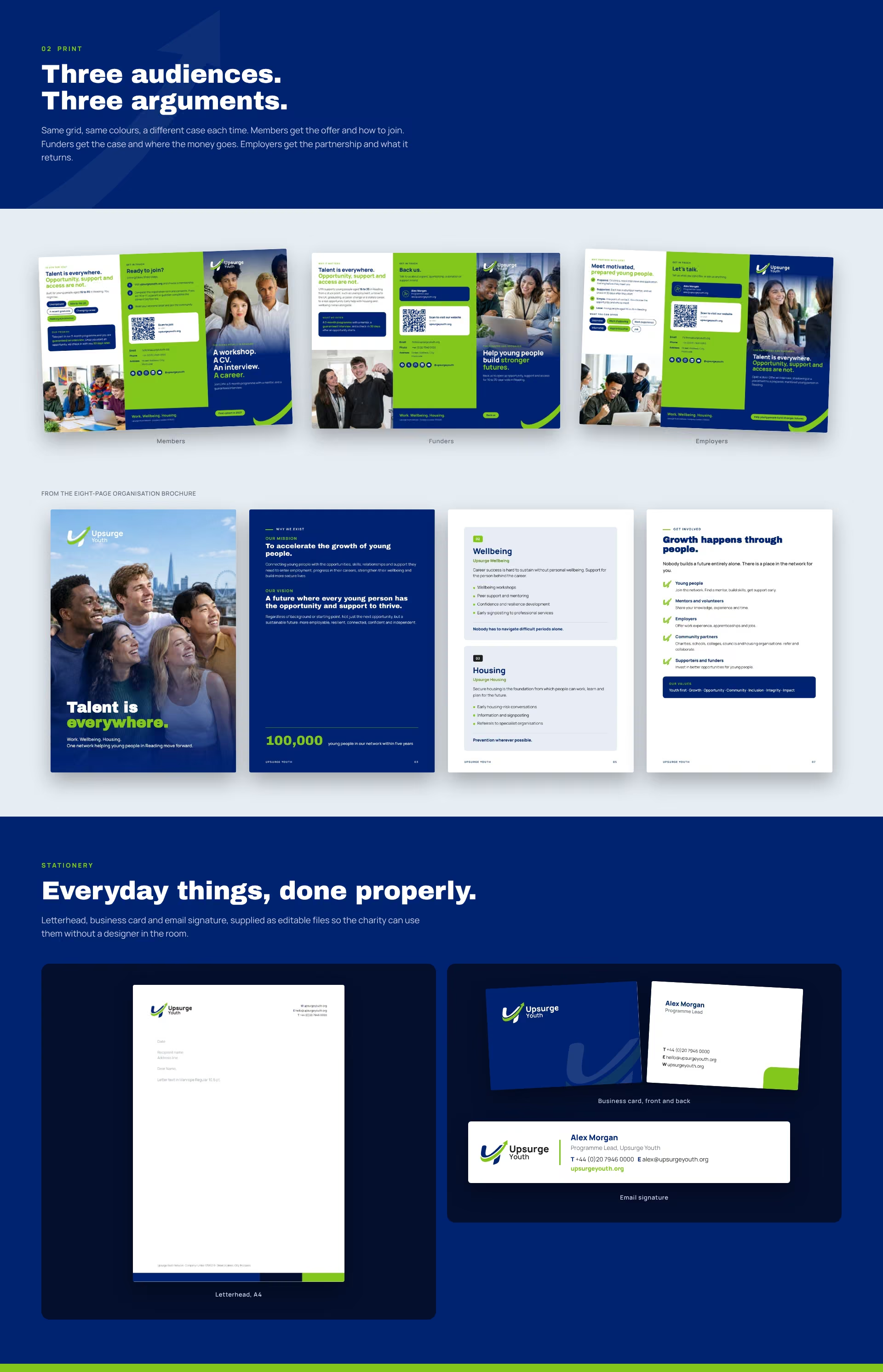
Three audiences, three brochures. Same grid, same colours, different argument. Members get the offer and how to join. Funders get the case and where the money goes. Employers get the partnership and what it returns. The roll-up banner was laid out for how people actually stand at events, with the message and the QR code in the upper half where they get read.
One mark, one system, three doors into it.
The logo draws an upward arrow through the U, so the name and the promise read as a single shape. Navy carries the authority that funders and employers look for. Green carries the energy that young people respond to. Manrope does the work in body text, Archivo Black lands the headlines, and the two never compete. The same single-mark thinking shaped another UK brand built around one drawn idea.
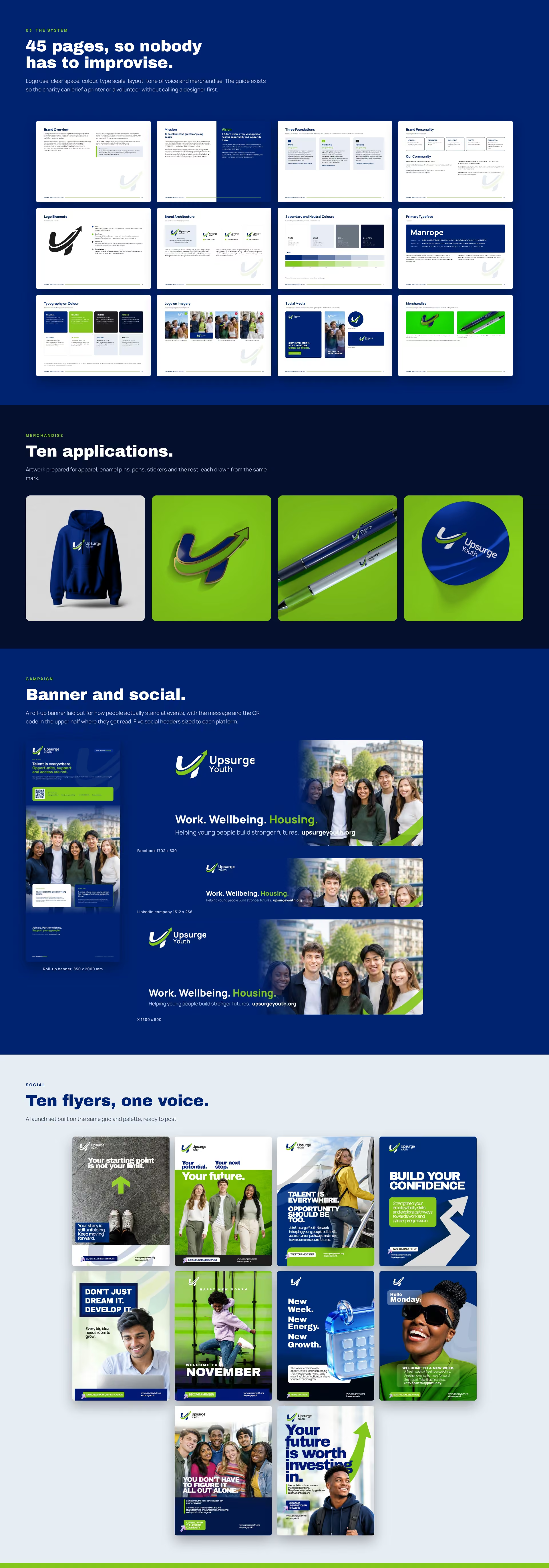
Upsurge Youth has one brand that holds across every audience and every surface. The team can print a brochure, stand a banner at an event and post to five platforms without redesigning anything first.
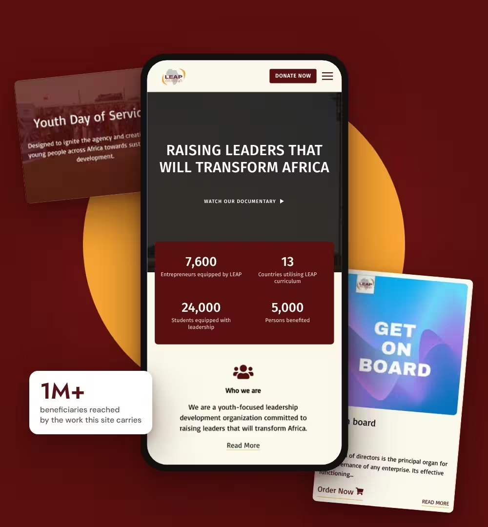
Every file was handed over editable, with the fonts and sources included. The charity owns its brand outright and does not need a designer in the room to use it. BeeTcore builds for the youth sector elsewhere too, including LEAP Africa and the Nigeria Youth Futures Fund.

At BeeTcore we design, build and grow websites, platforms and digital products that keep working long after launch. Over a decade in, 550+ projects delivered.
BeeTcore Solutions