

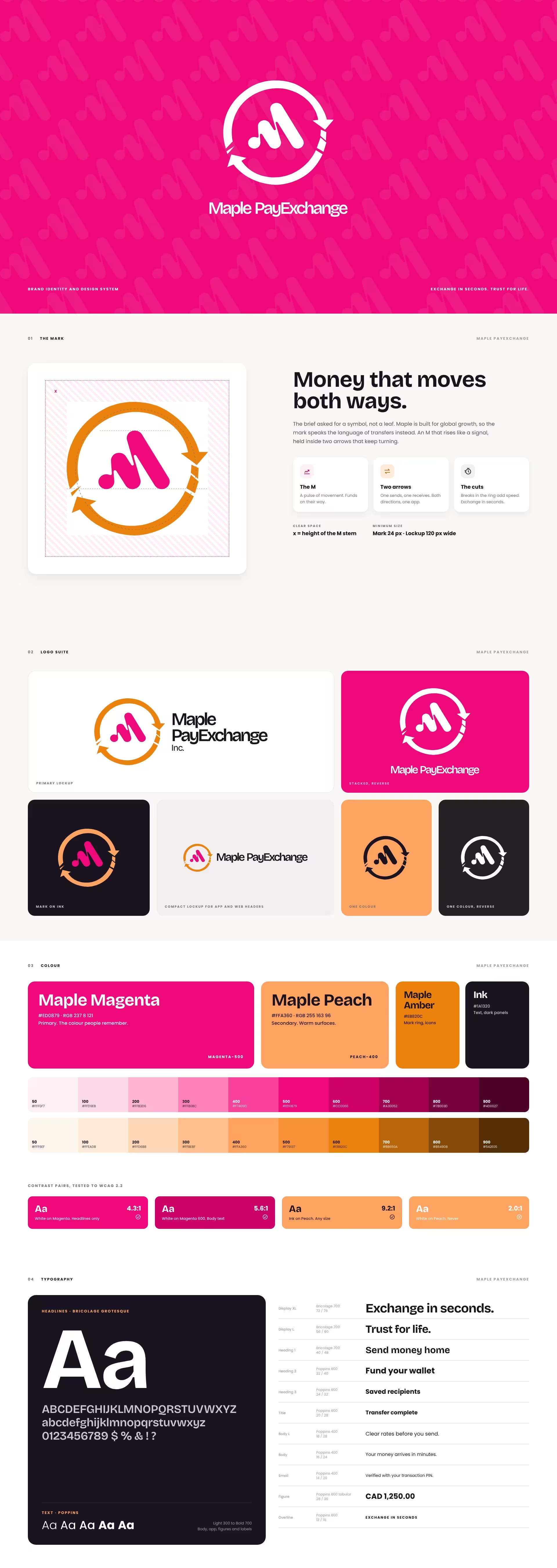
Maple PayExchange is a Canadian money services business. Newcomers, families and businesses use its mobile app to exchange currency and send money across borders.
The app was ready to grow. The brand was not. The old logo had been put together in a hurry, the leaf tied it to one country, and nothing on screen told a first-time user their money was safe here. In a category full of fast-moving rivals, Maple needed to look trustworthy at a glance.
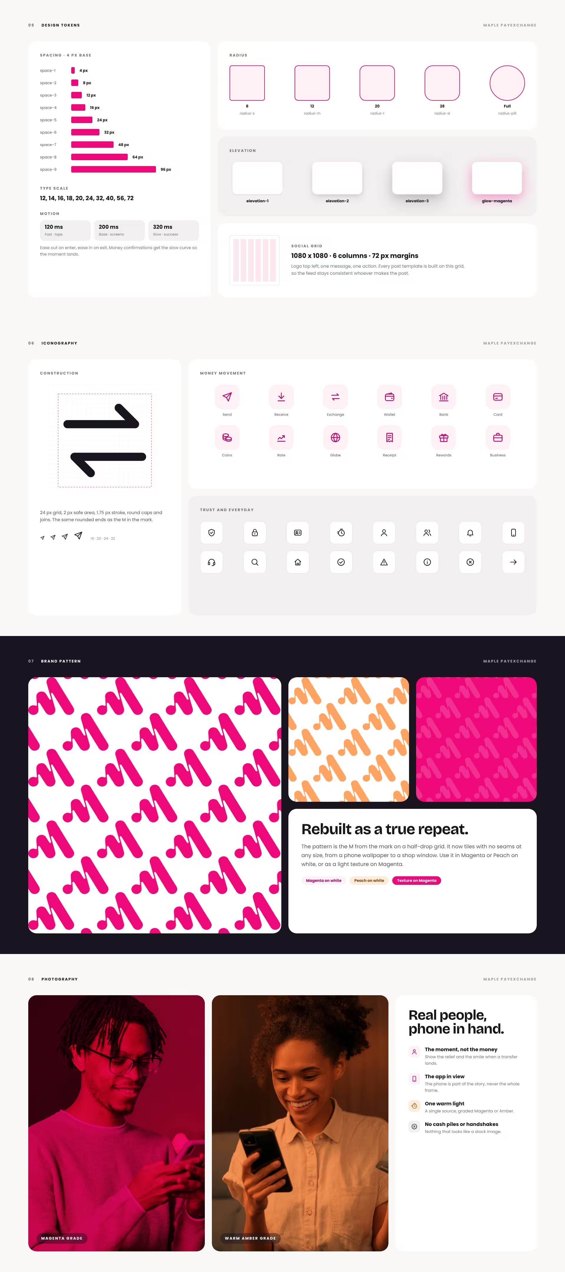
The mark speaks the language of money in motion. An M rises like a signal, held inside two arrows that keep turning: one sends, one receives. Cuts in the ring add speed. No leaf, so the brand travels as far as the business does.
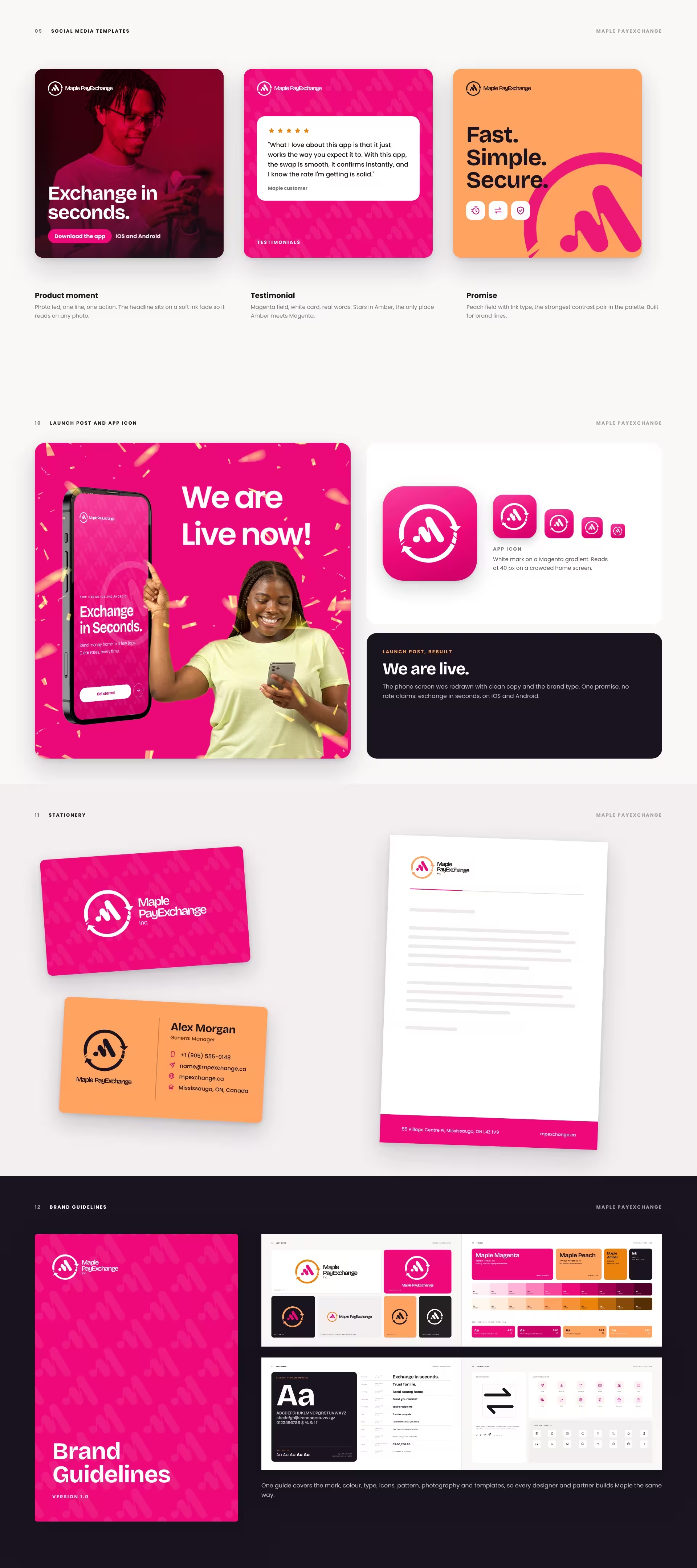
Maple Magenta and Maple Peach stay from the original brand, now built into full tint scales with tested contrast pairs. Bricolage Grotesque carries the headlines and Poppins carries everything else. Every colour, size and space is a named token, so the app, the feed and the paperwork look like one company.
What we delivered:
#ED0879, Maple Peach #FFA360 and Maple Amber #EB820C, with full tint scales and WCAG-tested contrast pairsIn fintech, people decide whether to trust you before they read a word. That is the standard BeeTcore builds to. Explore our brand identity work
Thank you for the level of professionalism displayed throughout the process. Your team went above and beyond to ensure this customer was fully satisfied. It is truly appreciated.
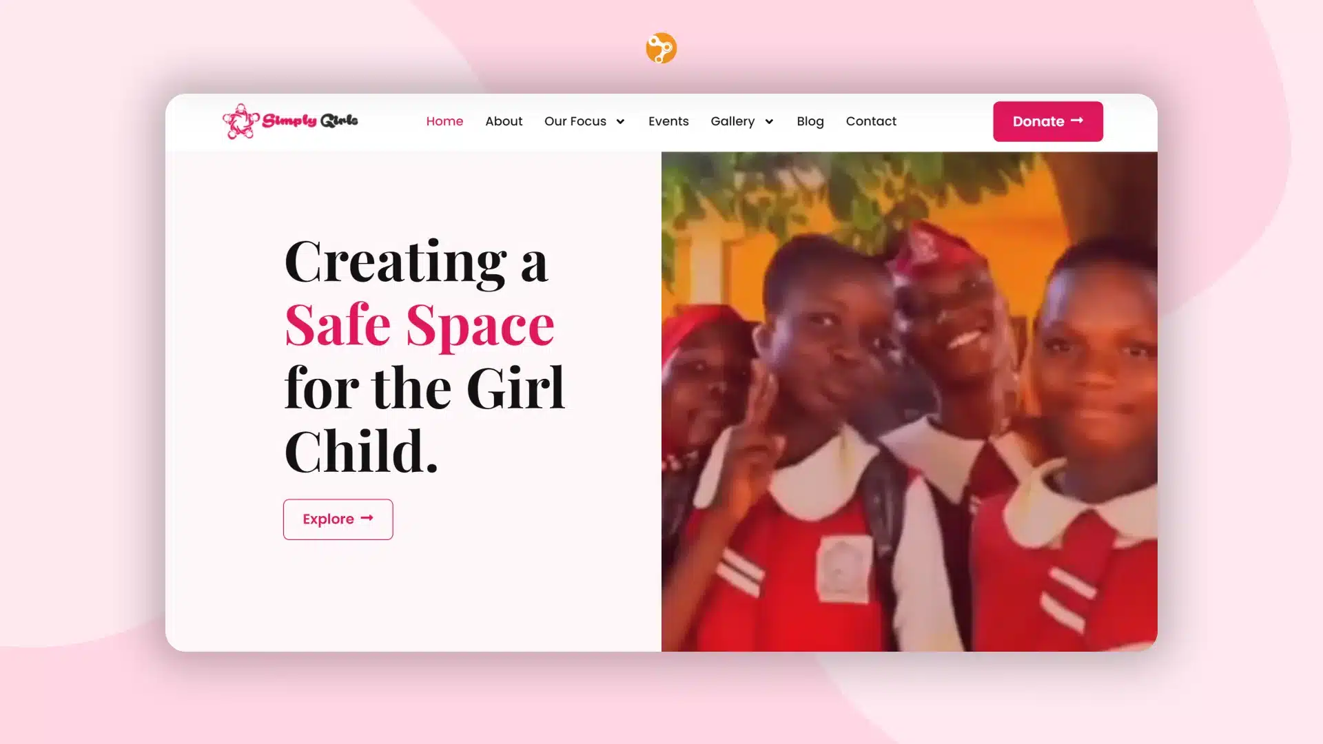

At BeeTcore we design, build and grow websites, platforms and digital products that keep working long after launch. Over a decade in, 550+ projects delivered.
BeeTcore Solutions