

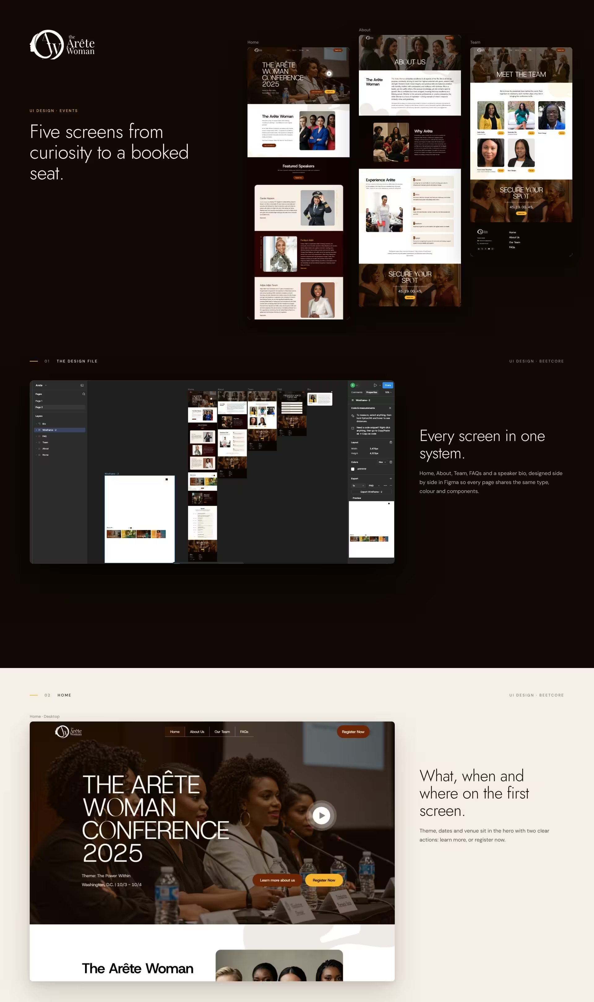
The Arête Woman Conference brings women building careers and businesses to Washington, DC for two days of keynotes, workshops and panels, under the theme The Power Within.
The organisers needed an interface that could carry a lot of detail (speakers, organisers, an hour-by-hour agenda, FAQs) without ever losing the one action that matters: registering.
5
3
AA
A first-time conference asks people to commit before there is a track record. Every screen had to earn trust, from who is speaking to who is organising, and still keep registration one tap away.
The content was long and mixed: six speaker bios, eight organisers, a full-day agenda and logistics. Shown flat, it would feel like a document. The design had to make it scannable on a phone first.
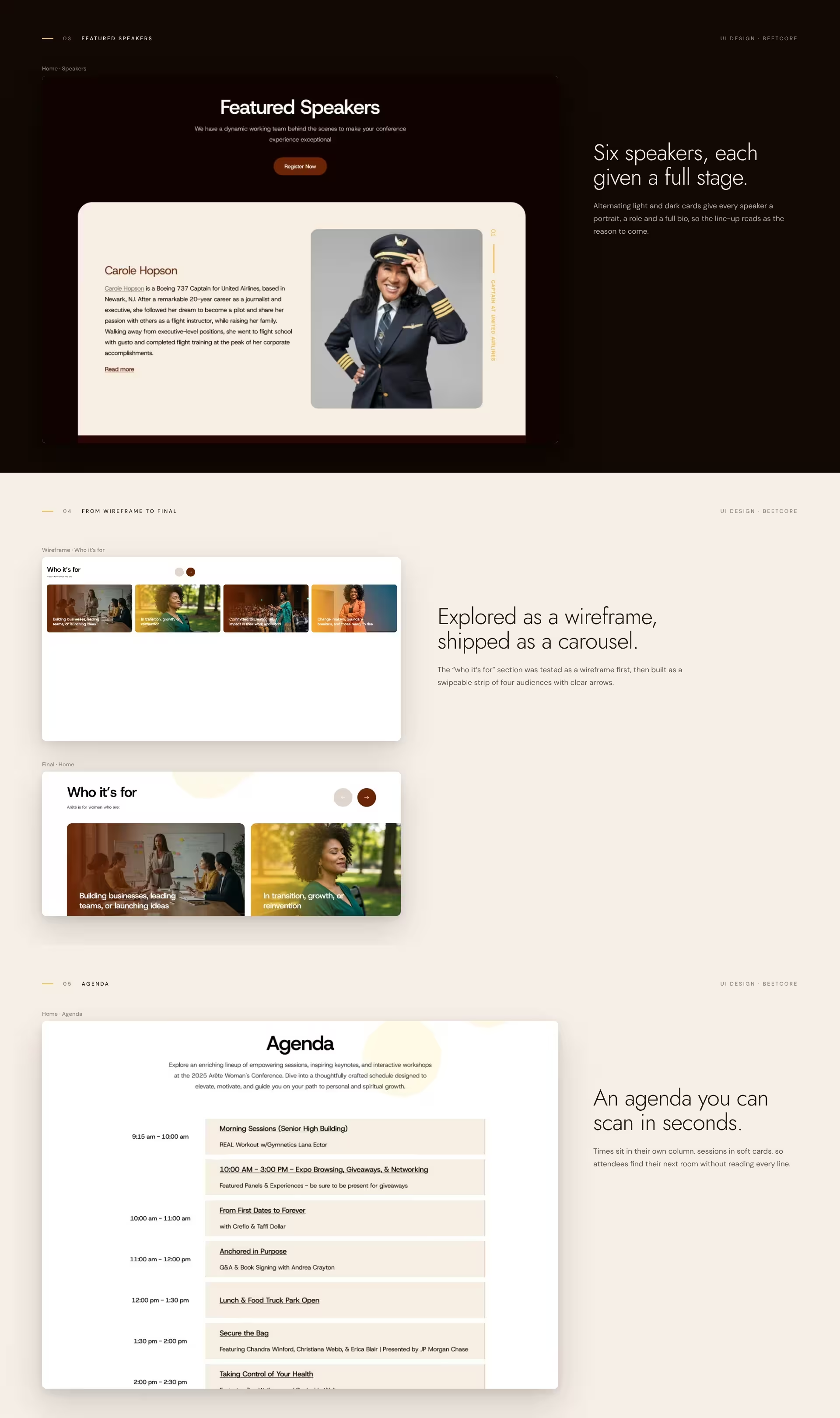
Interviews with the organisers mapped how their audience decides to attend: who is speaking, who is behind it, what happens on the day, how to register. That order became the order of the homepage.
Key sections were explored as wireframes first, such as the “who it’s for” strip, which was tested as a grid before becoming a four-card carousel. Usability checks against Nielsen’s heuristics shaped the sticky Register button, the scannable agenda and the FAQ accordion.
Espresso, rust, cream and gold, with light uppercase display type for a calm, confident voice. Speakers get alternating full-width cards. Five screens (Home, About, Team, FAQs and a speaker bio) share one component library in Figma.
Contrast, type sizes and touch targets follow WCAG 2.1 AA. Every screen was designed for mobile, tablet and desktop, with a bottom tab bar on phones.
A conference interface that builds trust in the order people need it, then makes registering the easy next step. The build followed these screens directly: see the website case study.
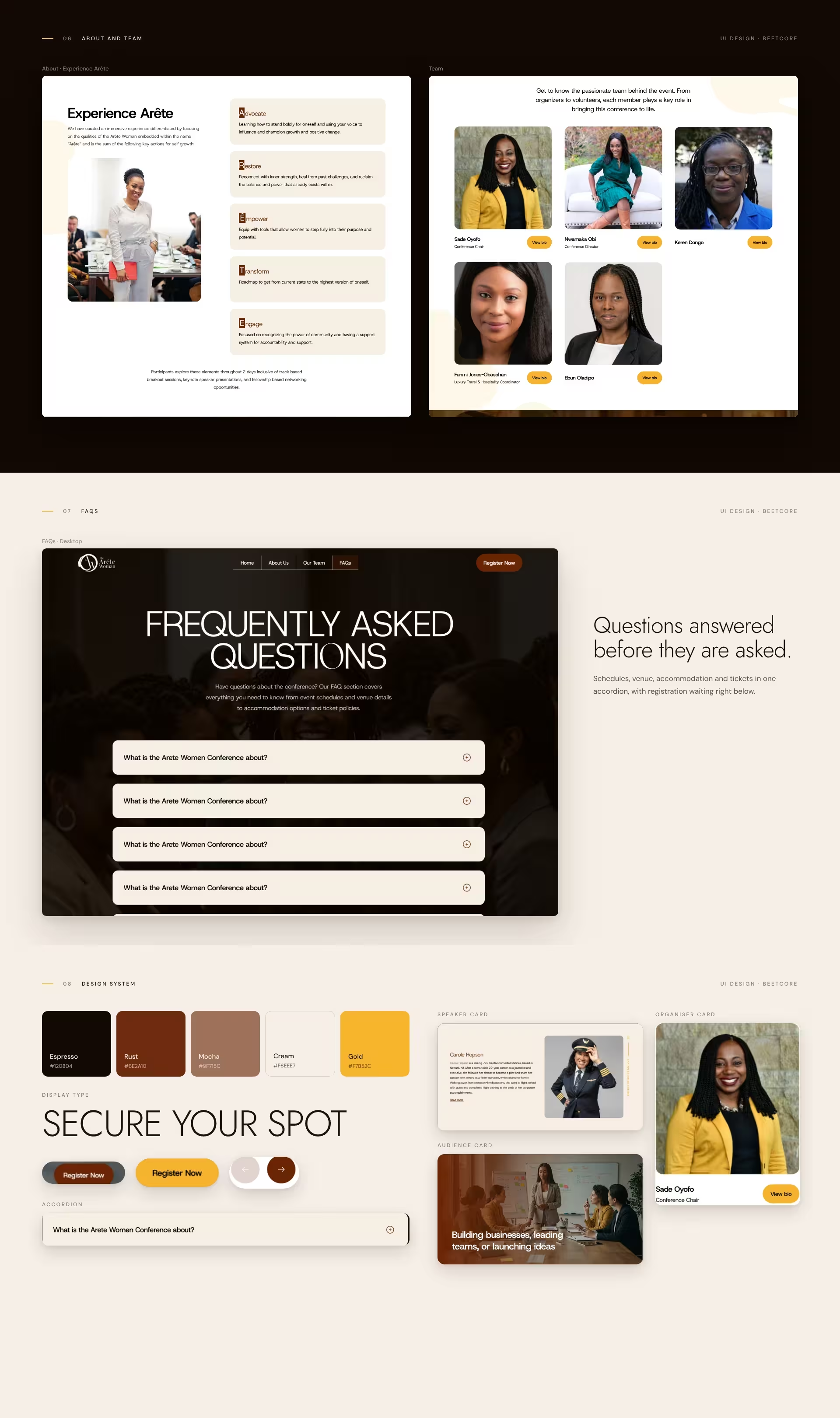
Five screens and one design system, handed to development with every component defined, so the build matched the design screen for screen.
At BeeTcore we design, build and grow websites, platforms and digital products that keep working long after launch. Over a decade in, 550+ projects delivered.
BeeTcore Solutions