

ARM Alternative Investments, part of the ARM Group, manages two funds for institutional and qualified investors: the ARM Africa Trade Finance Fund and the ARM Private Debt Fund.
The readers are boards, treasurers and allocators. They judge a fund manager by how it presents itself long before they read a return. The interface had to look like an institution from the first screen, and it had to be ready for build inside the same two weeks.
Two weeks for design and build together. That left no room for a design that changed its mind halfway through the build.
The content was dense: fund structures, comparison tables, governance and risk language. It had to read as calm and considered rather than a compliance archive, and every screen had to be agreed quickly by a busy client team.
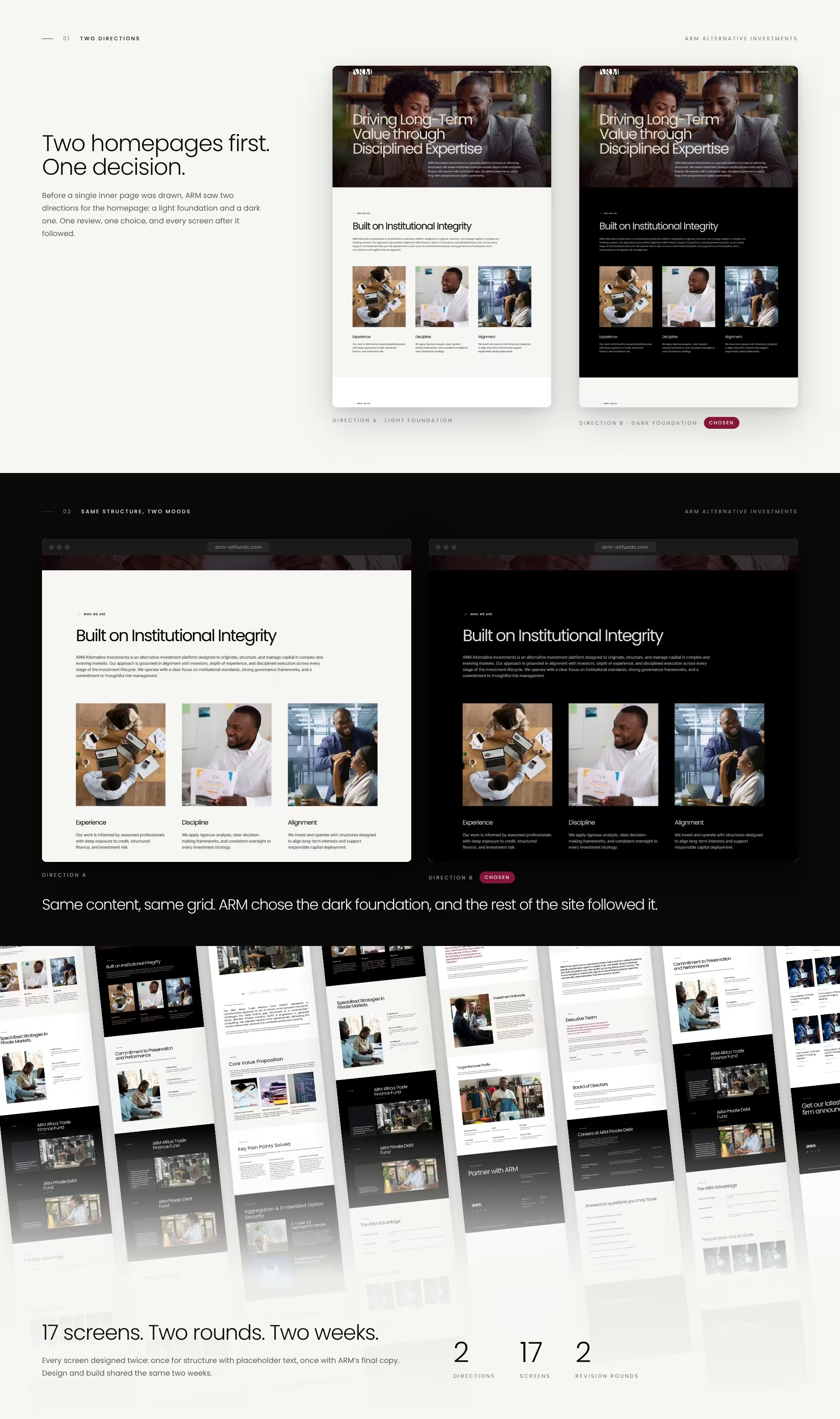
Before any inner page, ARM saw two homepage directions: a light foundation and a dark one, with the same structure and the same content. One review settled it. The dark direction won, and every screen after it followed that decision.
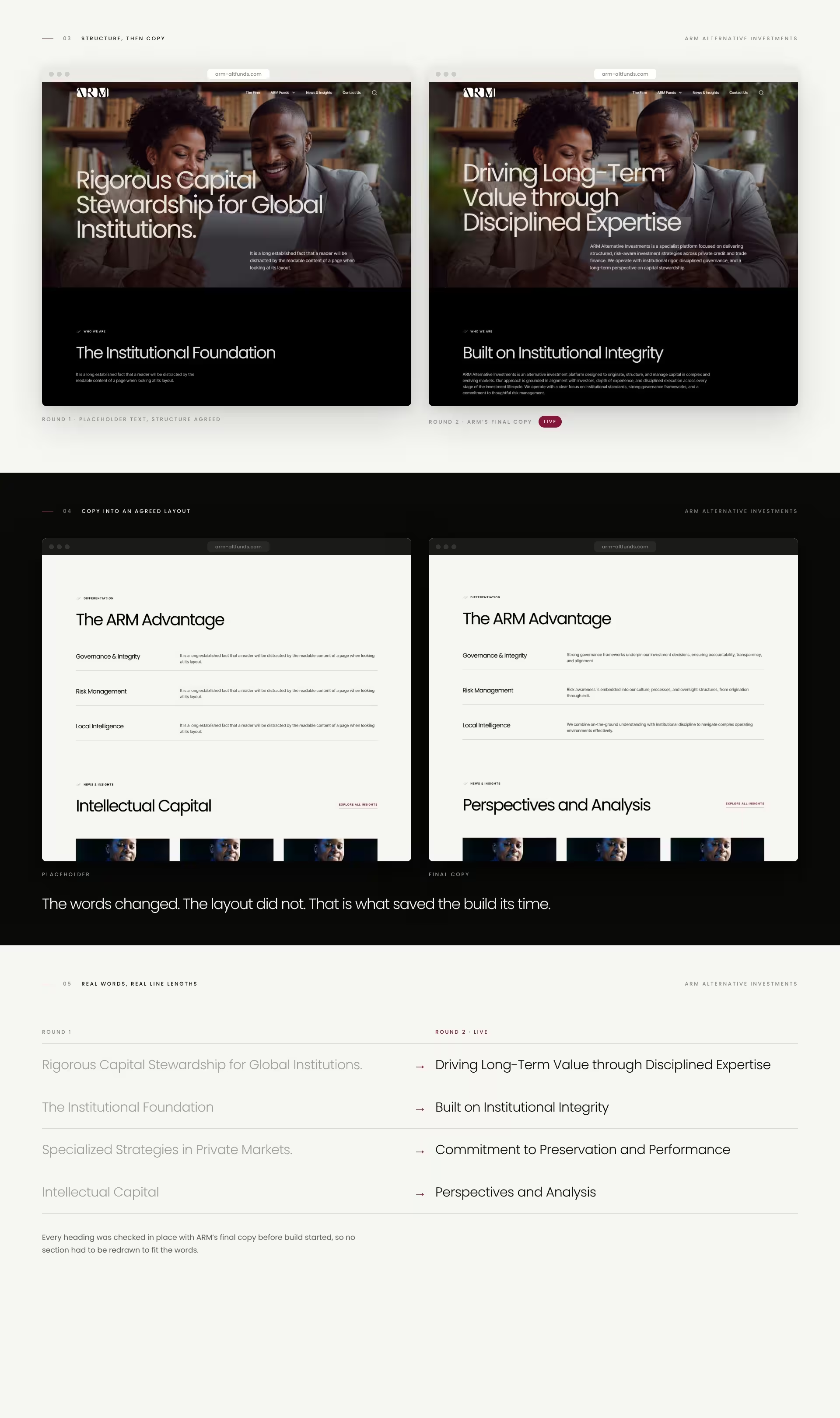
All 17 screens were designed with placeholder text first. Layout, hierarchy and the fund page pattern were agreed while the ARM team finalised their words.
The same 17 screens were rebuilt with ARM’s final copy. Every heading, table and paragraph was checked in place, so nothing had to be redrawn once build started. Two revision rounds in total.
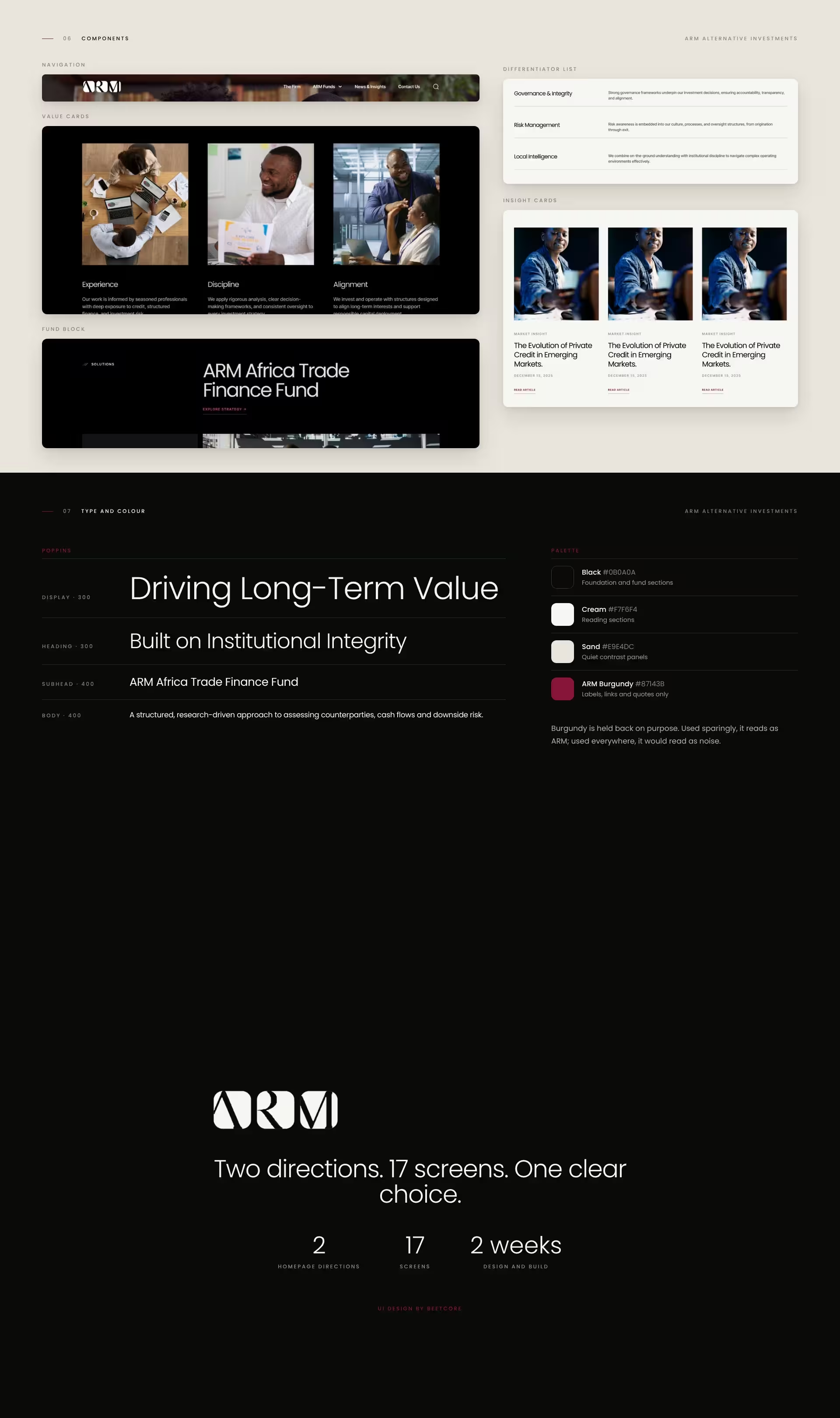
Black, cream and sand carry the pages. ARM Burgundy is held back for labels, links and quotes, so it always reads as the brand. Poppins in light display weights gives headings calm authority, with regular weights tuned for long reading.
A homepage chosen in one review, one fund pattern that works for both funds, and a component set the build could follow without guessing: navigation, value cards, fund blocks, differentiator lists and insight cards. Design and development worked from the same agreed screens, which is how the whole site fit inside two weeks.
See how it was built: the ARM website case study.
17 screens across two rounds, with two homepage directions shown before any inner page. UI design and the full build were delivered inside the same two weeks, over the Christmas period. Showing two directions up front is now part of how BeeTcore runs every UI project.


At BeeTcore we design, build and grow websites, platforms and digital products that keep working long after launch. Over a decade in, 550+ projects delivered.
BeeTcore Solutions