

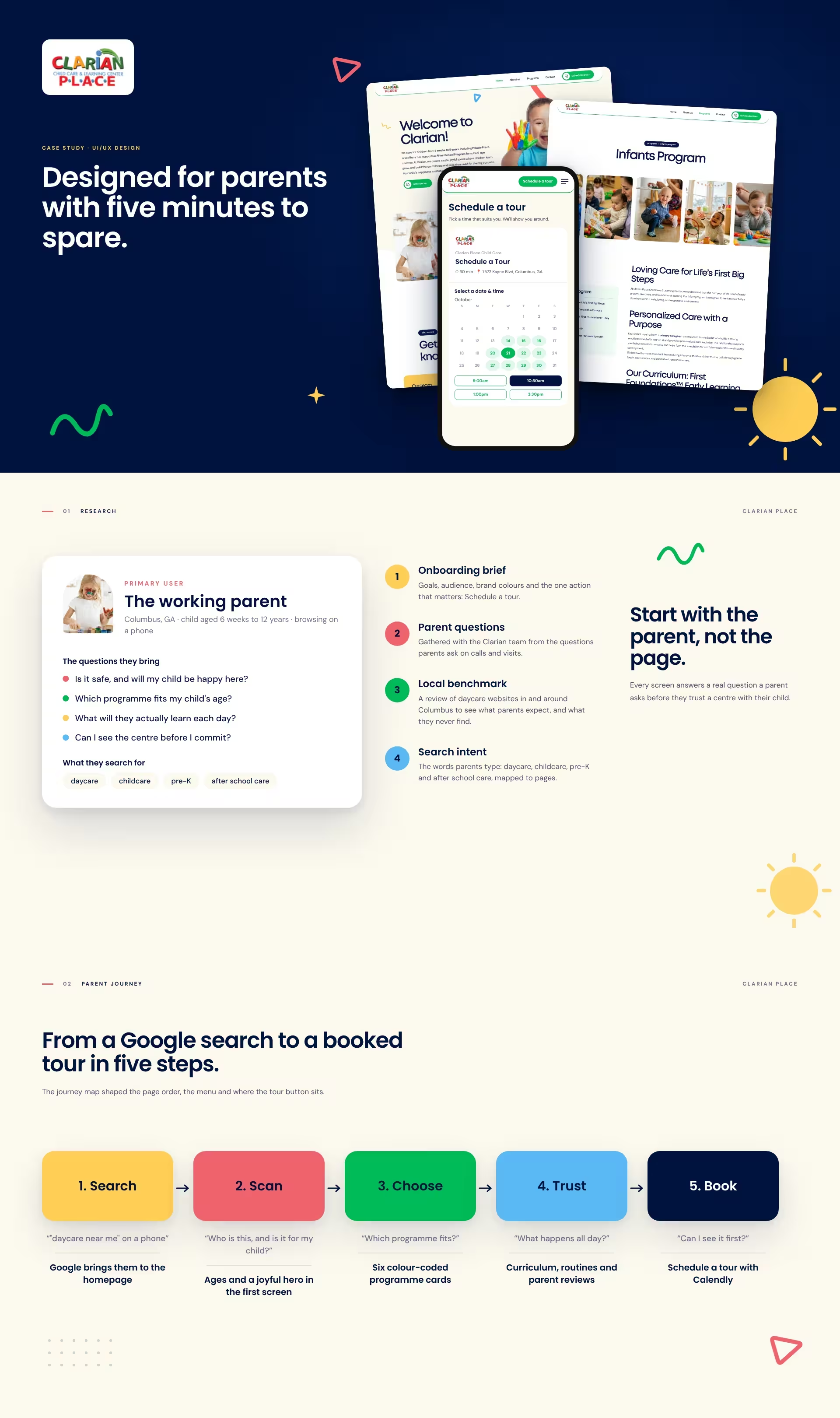
Clarian Place cares for children from 6 weeks to 5 years in Columbus, Georgia, with Private Pre-K, Before and After School Care and Summer School.
The brief was simple: help parents understand the centre fast, and get them to Schedule a tour.
5
6
50%
Parents choosing childcare are busy, often anxious, and usually on a phone. They want to know the centre is safe, that a programme fits their child’s age, and what a day looks like.
Six programmes, a curriculum and tour booking had to fit into a site that feels joyful without feeling chaotic.
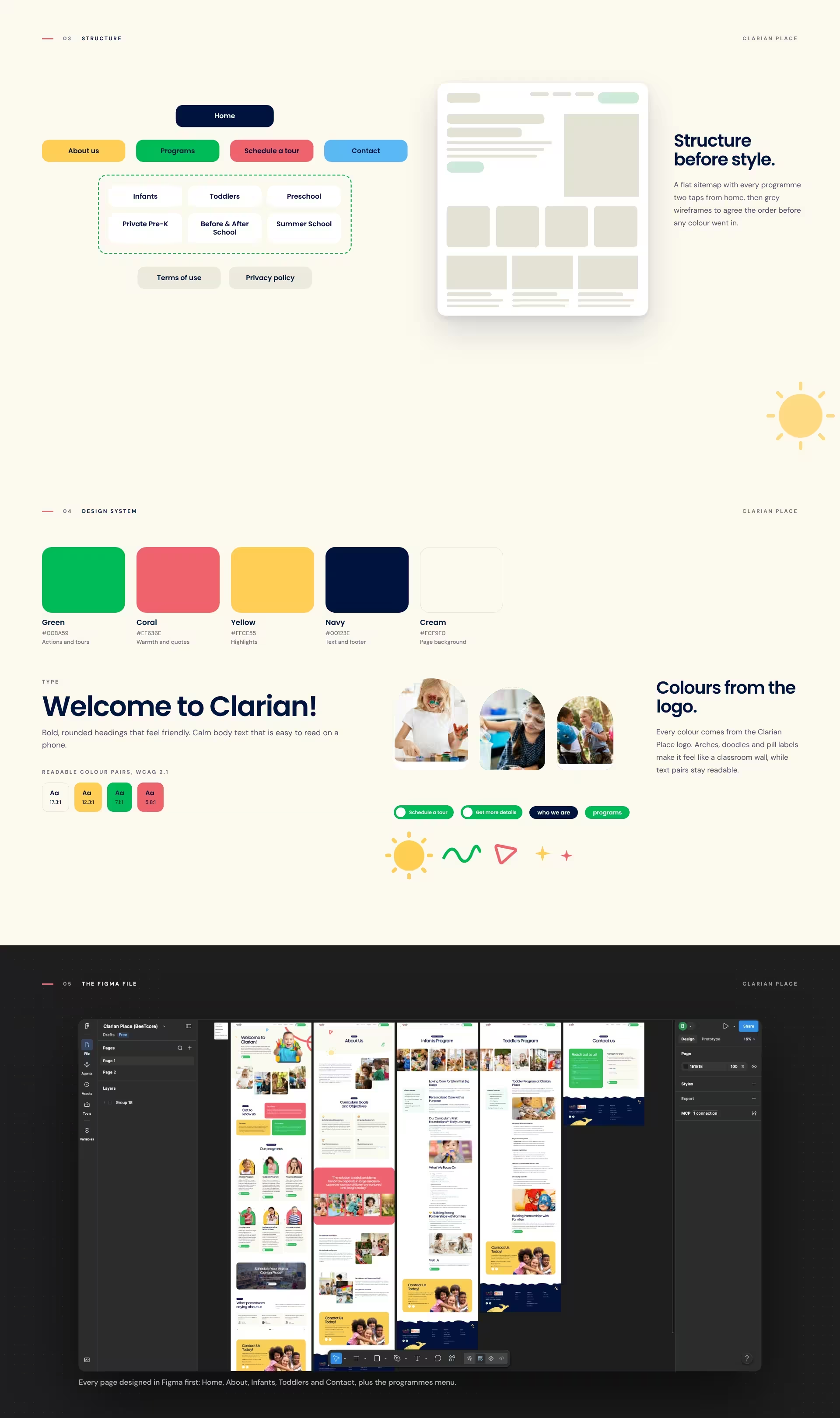
The onboarding brief, the questions parents ask the Clarian team on calls and visits, a review of local Columbus daycare websites, and the search terms parents use: daycare, childcare, pre-K and after school care.
Five steps from a Google search to a booked tour: search, scan, choose, trust and book. Each step got a design answer, from the age line in the hero to the tour button on every screen.
A flat sitemap with every programme two taps from home, then grey wireframes to agree the order before any colour went in.
Colours from the logo: green for actions, coral for warmth, yellow for highlights and navy for text. Arch photo frames, doodles and pill labels make it feel like a classroom wall, and text colour pairs meet WCAG 2.1 contrast.
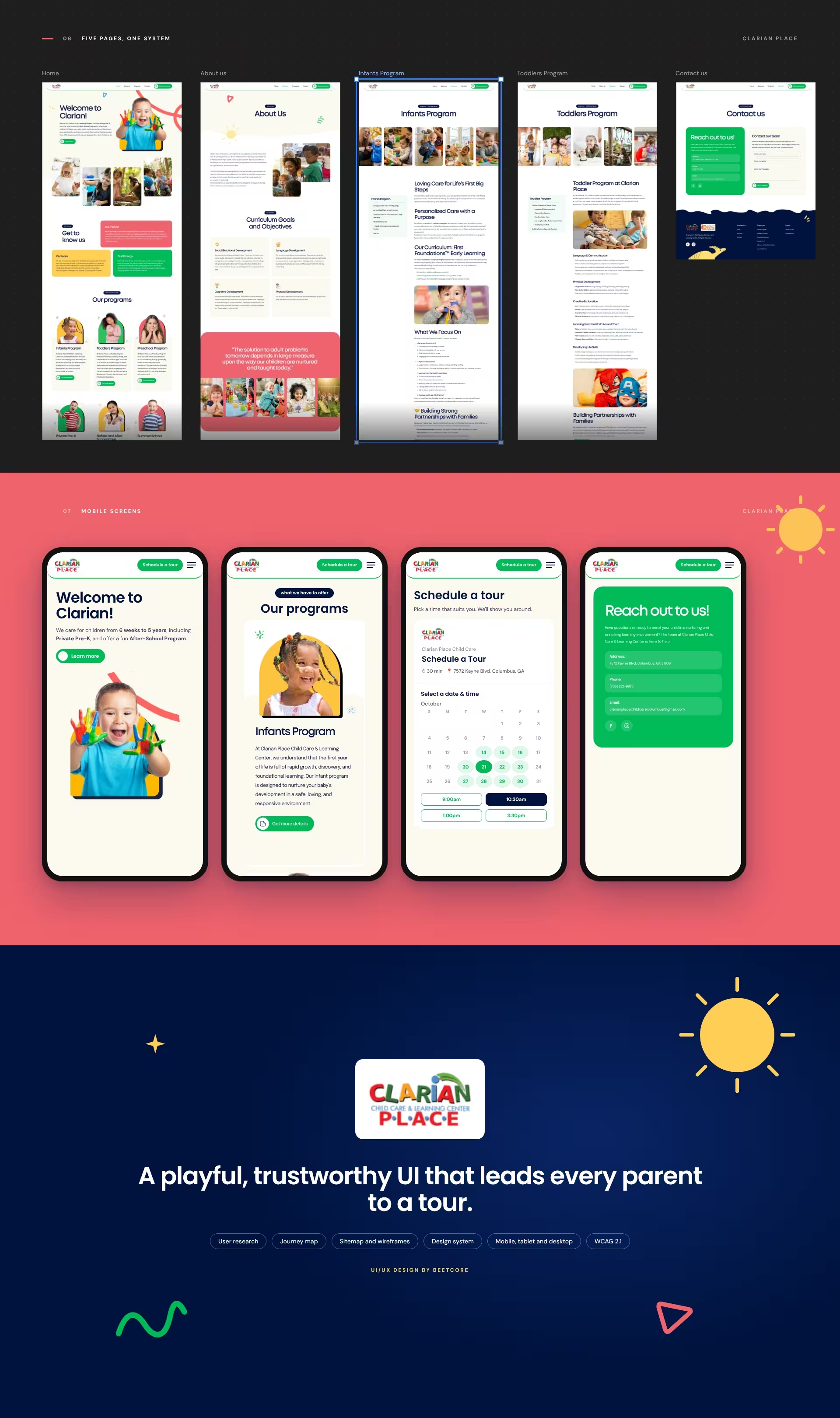
Every screen designed for mobile, tablet and desktop, then handed to BeeTcore’s development team for the build. See the website case study.
A playful, trustworthy interface that leads every parent to a tour.
The live site, built from these designs, has had 3.1K visitors since launch. Half arrive on a phone, and after the homepage they head straight to the programme pages, Contact and Schedule a tour: the path the journey map planned for.
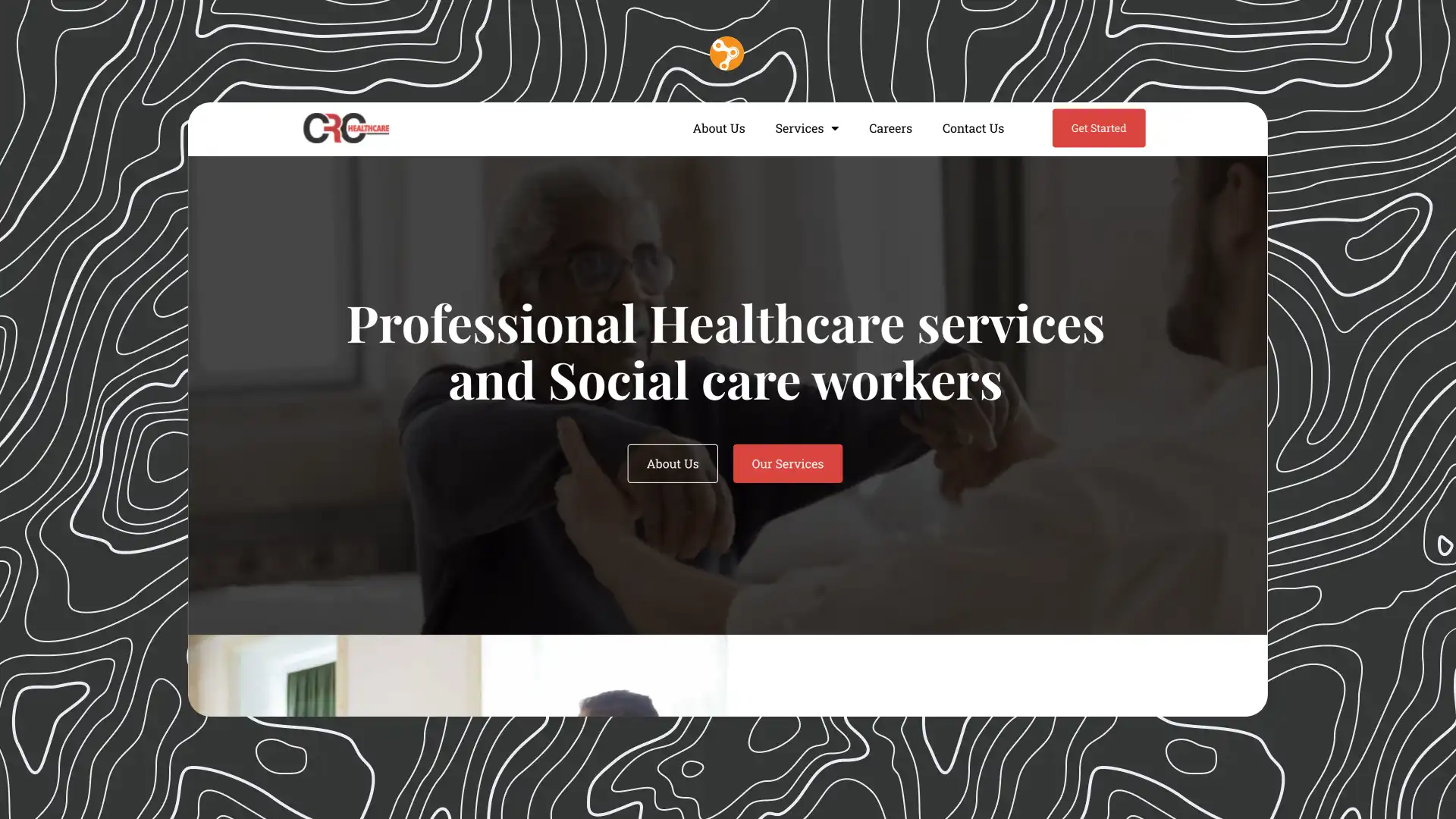


At BeeTcore we design, build and grow websites, platforms and digital products that keep working long after launch. Over a decade in, 550+ projects delivered.
BeeTcore Solutions