

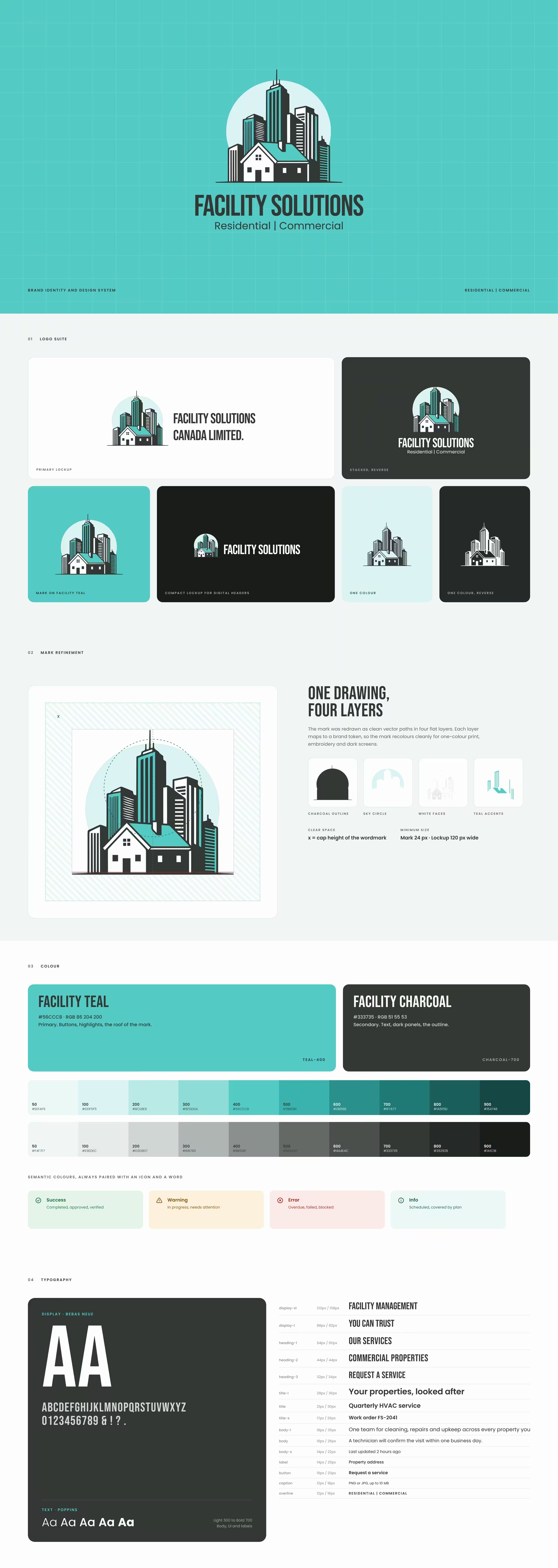
Facility Solutions Canada Limited looks after homes and commercial buildings. Cleaning, repairs, HVAC, grounds and seasonal care, all under one roof.
38
15
4
The service was strong, but it looked like a list of separate trades. Property managers hand over buildings they care about, so they need to see one organised team before the first visit, and on every invoice and app screen after it.
The mark puts both halves of the business in one drawing. A family home stands in front of a city skyline, set against a pale sky circle. Residential and commercial, side by side, in Facility Teal and Facility Charcoal.
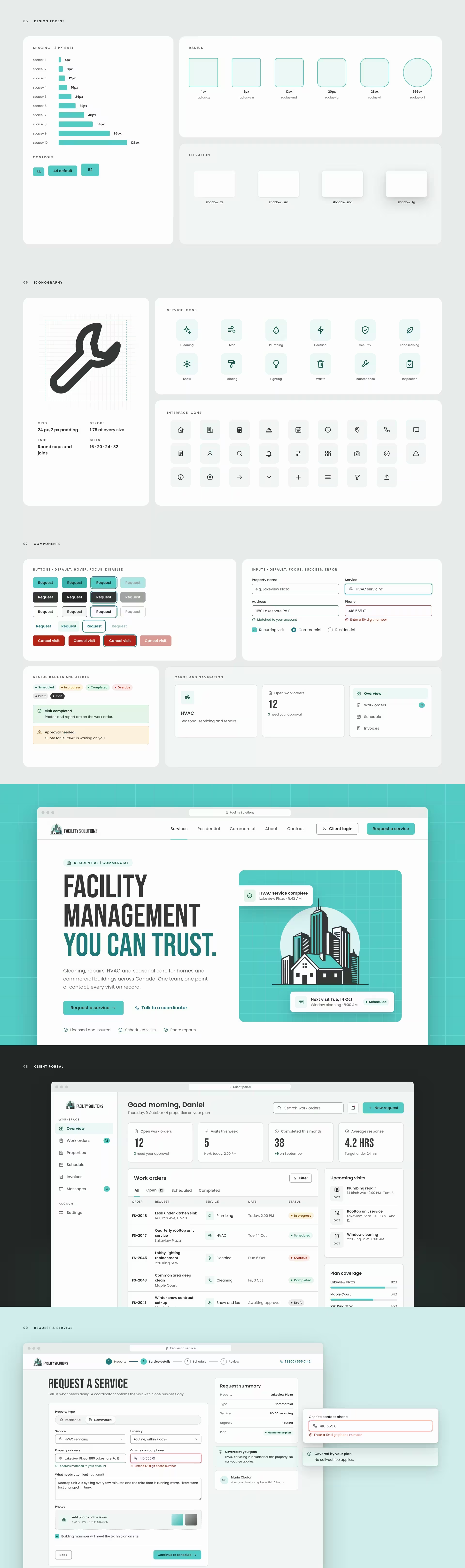
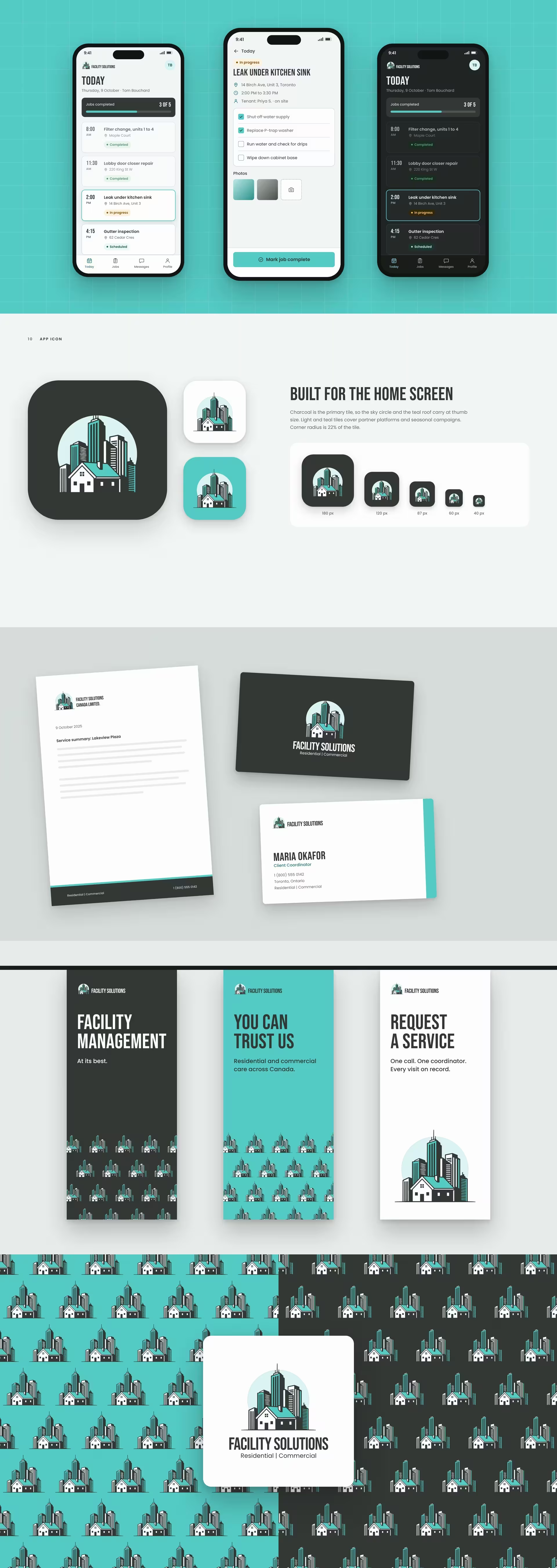
That mark became the start of a complete design system. Every colour, size and space is a named token. Every component has its states drawn. Every screen is built from the same parts, so the website, the client portal and the technician app look like one company.
What we delivered:
#56CCC8 and Facility Charcoal #333735, full tint scales, and success, warning, error and info colours that meet WCAG contrastSee the brand at work on the Facility Solutions Canada website and in the UI case study.
A brand earns trust when it looks the same at the front desk, on the invoice and in the app. That is the standard BeeTcore builds to. Explore our brand identity work


At BeeTcore we design, build and grow websites, platforms and digital products that keep working long after launch. Over a decade in, 550+ projects delivered.
BeeTcore Solutions