Facility Solutions Canada logo mark

Facility Solutions Canada: Brand Identity and Design System

A brand and full design system for a Canadian facility management company, from the mark to the client portal
SERVICES
Branding
INDUSTRY
Professional Services
COUNTRY
Canada
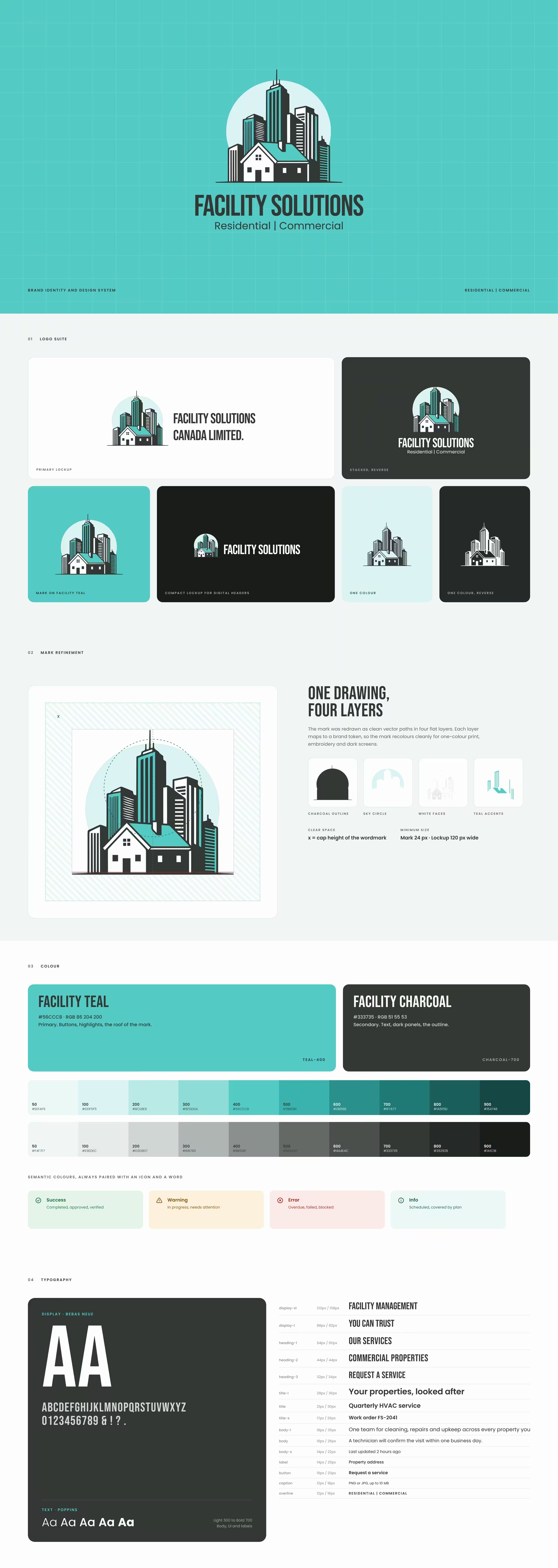
Facility Solutions Canada logo suite, mark refinement, colour palette and typography

About the project.

Facility Solutions Canada Limited looks after homes and commercial buildings. Cleaning, repairs, HVAC, grounds and seasonal care, all under one roof.

Custom icons, 12 for facility services
38
Steps in the type scale
15
Product screens: website, service request, client portal and technician app
4

Building something with the same shape?

Challenge.

The service was strong, but it looked like a list of separate trades. Property managers hand over buildings they care about, so they need to see one organised team before the first visit, and on every invoice and app screen after it.
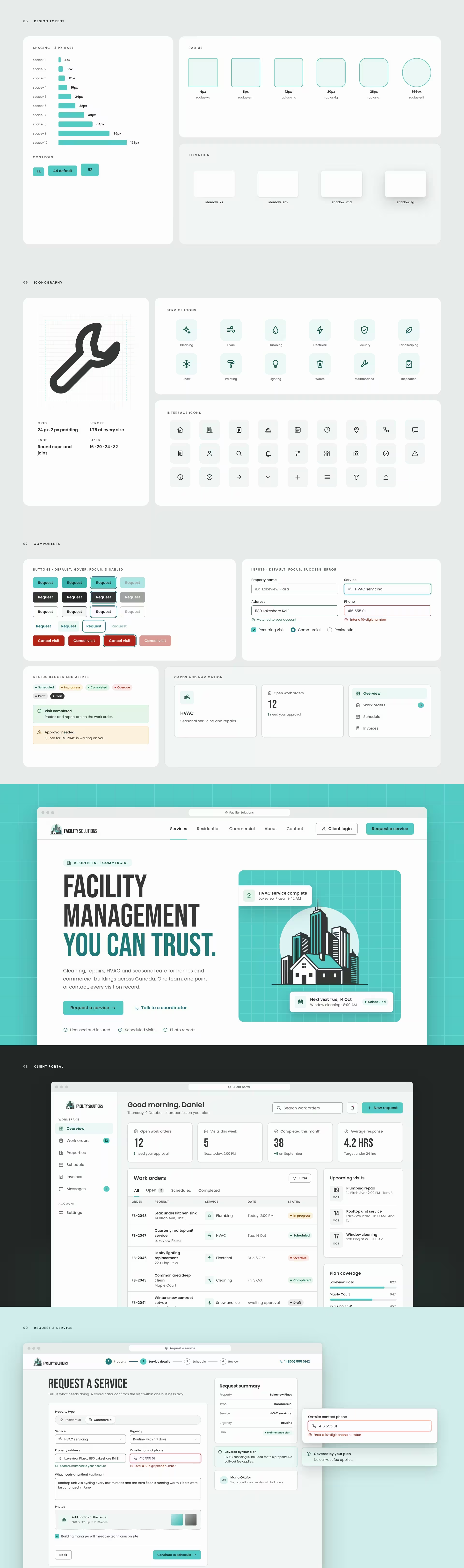
Facility Solutions design tokens, icon set, components, and website, client portal and request screens

Solution.

The mark puts both halves of the business in one drawing. A family home stands in front of a city skyline, set against a pale sky circle. Residential and commercial, side by side, in Facility Teal and Facility Charcoal.

That mark became the start of a complete design system. Every colour, size and space is a named token. Every component has its states drawn. Every screen is built from the same parts, so the website, the client portal and the technician app look like one company.

What we delivered:

  • Logo suite: horizontal, stacked and compact lockups, mark, wordmark and one-colour versions
  • Mark refinement: redrawn as clean vector in four colour layers, with clear space and minimum sizes
  • Colour system: Facility Teal #56CCC8 and Facility Charcoal #333735, full tint scales, and success, warning, error and info colours that meet WCAG contrast
  • Typography: Bebas Neue for display and Poppins for text, with a 15-step type scale
  • Design tokens: spacing, radius, elevation, icon and control sizes, in light and dark themes
  • Icon set: 38 custom line icons, including 12 for facility services
  • Components with every state: buttons, inputs, selects, checkboxes, badges, cards, alerts, navigation, tabs and steps
  • Product screens: website home, request a service flow, client portal and technician mobile app
  • App icon, brand pattern, stationery, signage and the brand guidelines

A brand earns trust when it looks the same at the front desk, on the invoice and in the app. That is the standard BeeTcore builds to. Explore our brand identity work
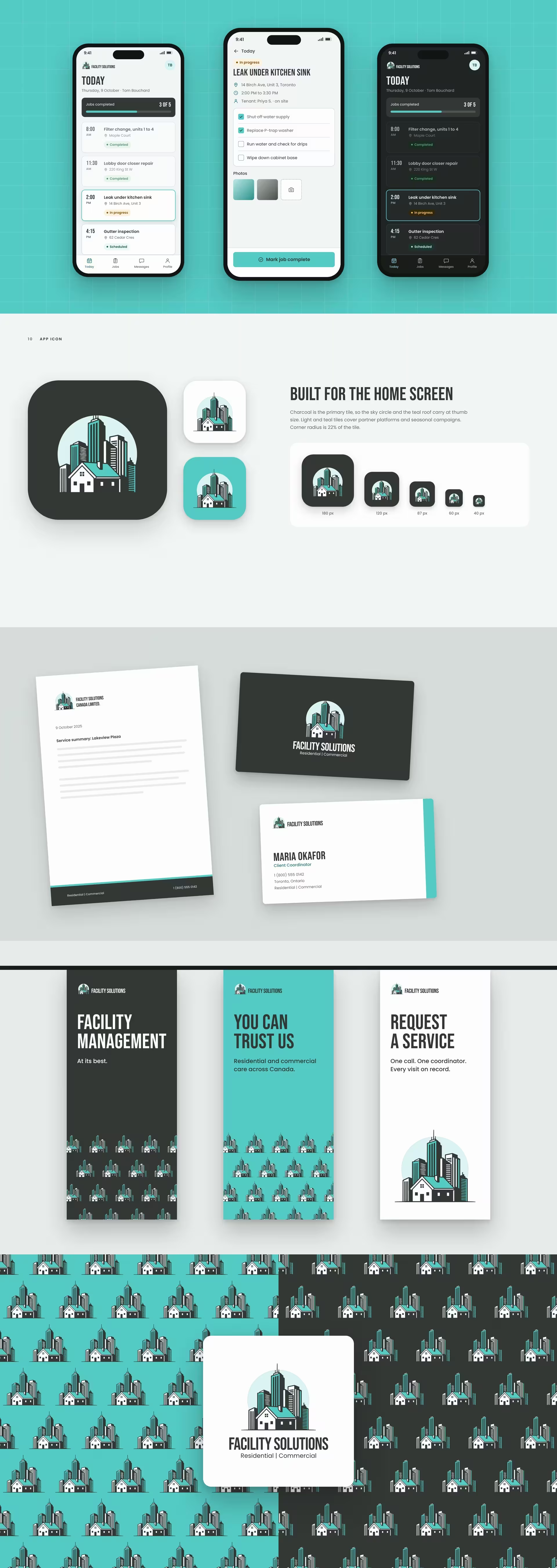
Facility Solutions technician app, app icon, stationery, signage and brand pattern

Other projects.

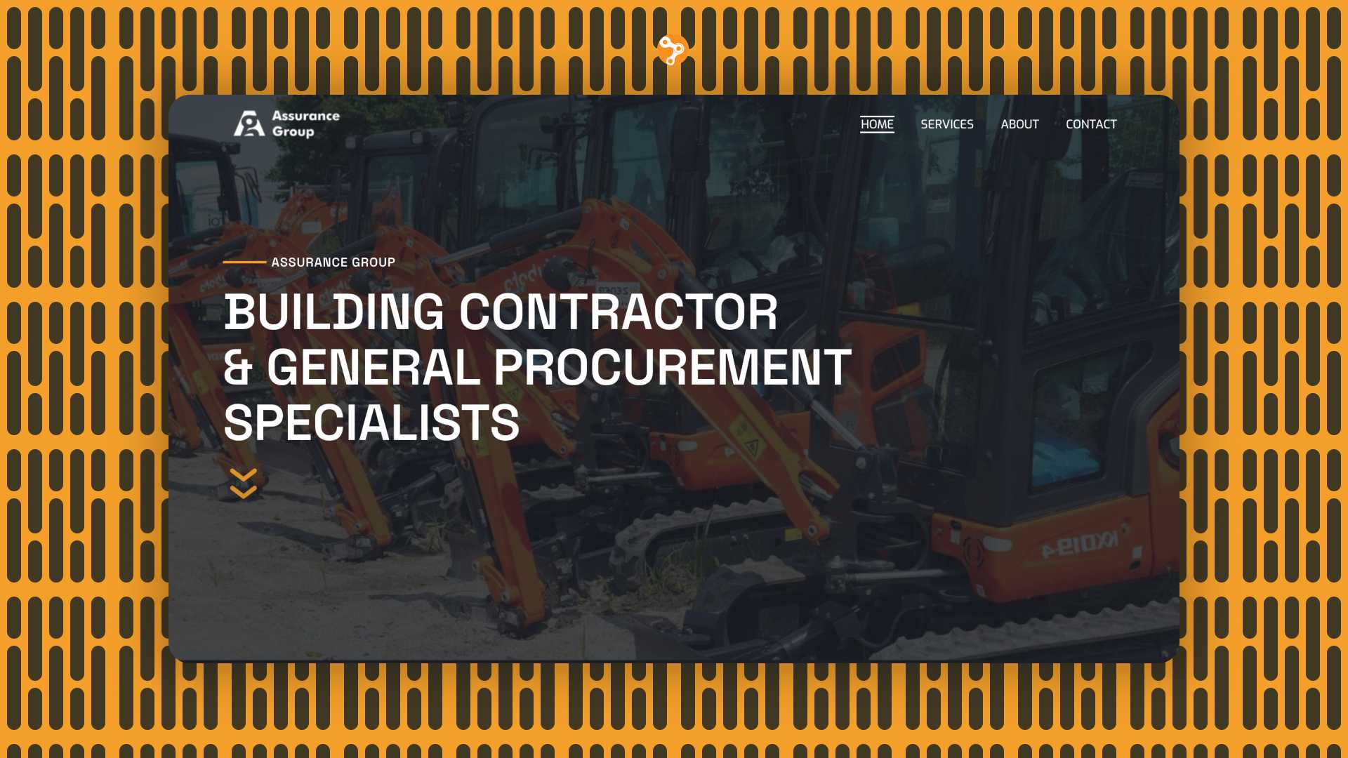
Assurance Group

Web design for a building contractor & general procurement specialist
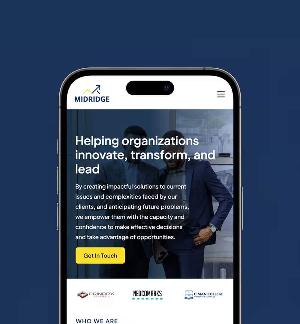
Midridge logo

Midridge International

Building a dynamic online presence for a financial consulting firm

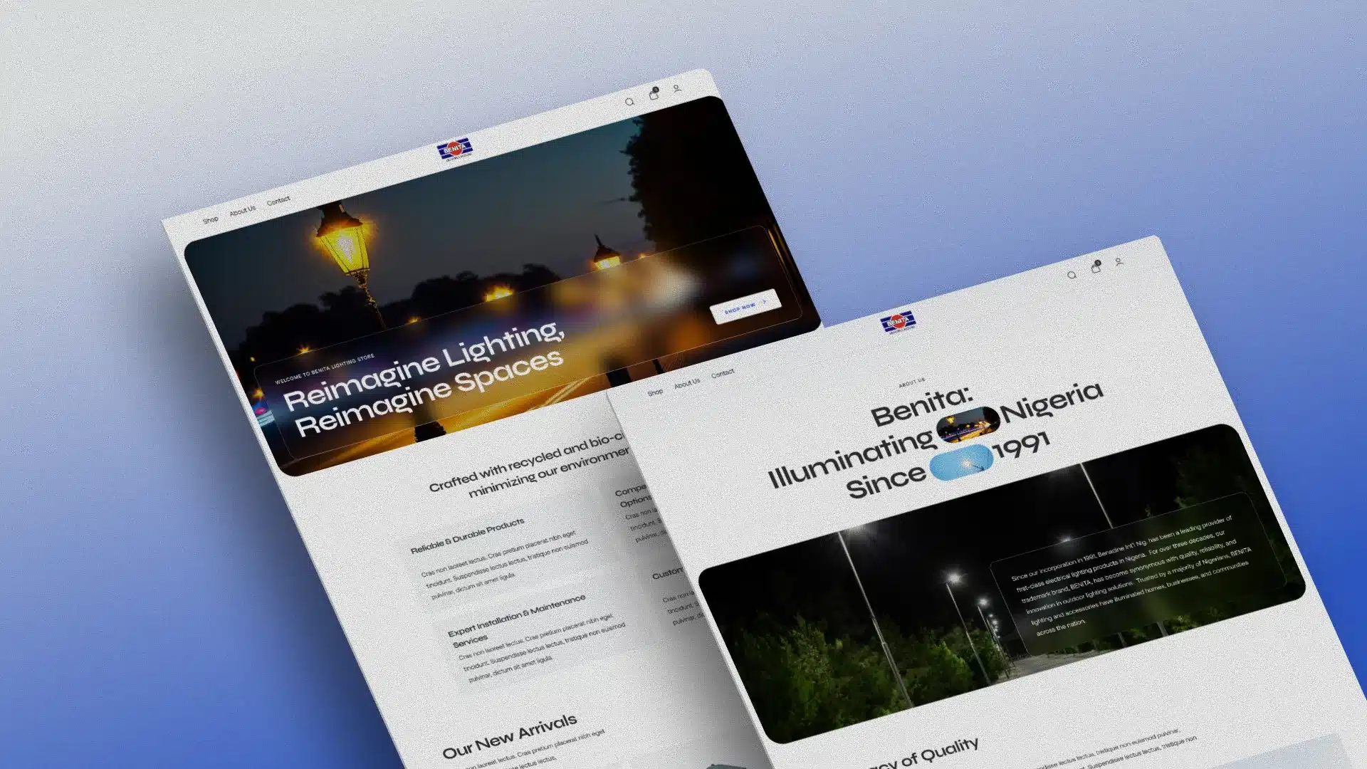
Benita Lighting | UI

Refined UX/UI redesign elevating Nigeria’s trusted lighting brand

We’re BeeTcore.

At BeeTcore we design, build and grow websites, platforms and digital products that keep working long after launch. Over a decade in, 550+ projects delivered.